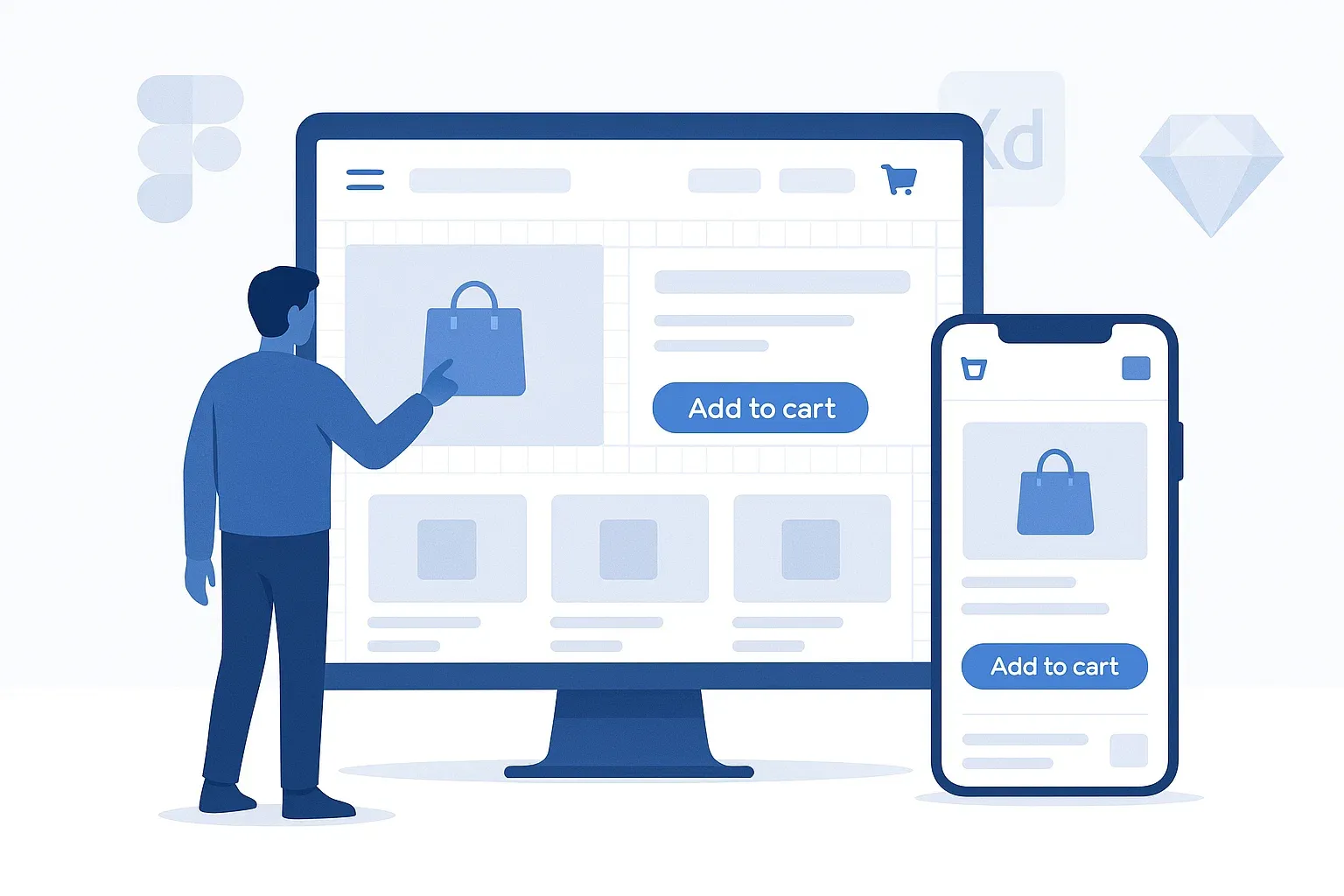
User Interface (UI) Design: How to Make Your Online Store Easy to Use and Visually Appealing?
In the world of e-commerce, looks aren’t everything—but how the interface helps the user feel comfortable, find what they need, and take action easily? That’s everything.
That’s why User Interface (UI) design has become a key factor in the success of any online store. It’s not just about creating something that looks nice; it’s about influencing how visitors behave from the moment they land on your site until they complete a purchase.
No customer will stay on a messy or visually confusing site. But when the interface is clean, the colors are comfortable, and buttons are in the right places, they’ll move through the site smoothly—without even thinking about it—and complete their journey.
In this article, we’ll explore everything you need to know about User Interface design for e-commerce stores:
We’ll break down the difference between UI and User Experience (UX), walk through the essential elements of a user interface, highlight the best tools to design a professional layout, and reveal the common mistakes to avoid if you want your store to convert—not just look good.
What is User Interface (UI) Design?
User Interface (UI) design is the art and science of combining clarity and interaction to deliver a smooth and visually appealing experience for users who visit your website or app. In simple terms, UI is everything your customer sees and interacts with—buttons, colors, images, fonts, navigation menus, and the overall layout.
When someone visits your e-commerce store, the first thing they notice is the look and structure of the website. Is the homepage clean and organized? Is the menu easy to understand? Are the buttons easy to find and use? All of these fall under UI design. And the interesting part is—users may not consciously notice good design, but they’ll immediately feel frustrated when the design is bad.
The goal of UI is not just to make the website “look nice,” but to make interaction intuitive and simple. For example, if a customer sees a promotion, they should be able to click on it effortlessly. When they want to add a product to their cart, the button should be clearly visible. And the checkout process? It should be simple and user-friendly.
And if your store targets mobile users (which is most of your audience nowadays), your user interface must be responsive, meaning it adapts smoothly to smaller screens while keeping the visual identity intact.
In short, effective e-commerce UI design balances beauty with functionality—creating a site that looks good and works even better.
The Difference Between UI and UX
Many people confuse User Interface (UI) with User Experience (UX)—and that’s understandable, as the two terms are closely related and often work hand in hand. But in reality, each plays a very different role, and understanding the difference is essential if you want to build a truly effective e-commerce store.
UI – User Interface
This is the visual and interactive layer of your website. It includes the buttons your users click, the colors they see, the structure of the page, the way products are displayed, and the fonts used throughout the design. UI answers questions like: How does the site look? Is it visually appealing? Is it easy to interact with?
UX – User Experience
UX, on the other hand, is broader. It focuses on the entire journey the user takes while interacting with your store—from the moment they land on the homepage until they complete their purchase or exit the site. UX cares about how users feel, how easily they find what they need, how quickly they complete actions, and how satisfied they are with the overall experience.
So in simple terms:
UI is about appearance and interaction
UX is about functionality and flow
Example: Let’s say you have a bright red “Buy Now” button that’s well-designed and placed correctly (great UI). But if your checkout process involves six confusing steps, hidden costs, or technical errors, that’s a poor UX—even if the visuals are perfect.
That’s why a great e-commerce design needs both: eye-catching UI that draws users in, and smart UX that keeps them engaged and leads them to conversion.
Key UI Elements in E-Commerce Stores
To create an effective user interface (UI) for your online store, you need to focus on specific elements that appear in nearly every successful e-commerce platform. Each of these components has a unique purpose and contributes to the customer’s overall experience. When designed well, they make navigation effortless and lead users smoothly through the sales journey.
Header
The header is the first thing a customer sees when they visit your site, and it sets the tone for their experience. It should be clean, organized, and include key elements like:
Your store’s logo (clearly visible and clickable)
A search bar
Quick links (e.g., login, wishlist, cart)
Optionally, a top bar for announcements or promotions
A well-designed header helps visitors quickly find what they need and navigate with confidence.
Navigation Menu (Top or Side Menu)
This is your store’s internal map. It needs to be simple, logical, and clearly structured. Main categories should be easy to understand, and subcategories should appear in an organized way (not all at once).
On mobile, this menu usually turns into a hamburger menu—a collapsible icon that should be easy to access and browse.
Product Page
This is one of the most important parts of any store. The UI of the product page must present information clearly and encourage the user to make a purchase. Key elements include:
High-quality product images
A clear title and concise description
Price and options (quantity, size, color, etc.)
A bold “Add to Cart” or “Buy Now” button
Customer reviews and ratings
Shipping and return information (if applicable)
Everything on this page should be in its proper place and easy to absorb at a glance.
Buttons (CTAs)
Your buttons are your calls to action—“Buy Now,” “Add to Wishlist,” “Proceed to Checkout.” They must stand out with distinctive colors, be large enough to click easily, and use clear, action-driven language.
Also, their placement is critical. Users should find the right button exactly when they need it—without having to scroll or search.
Footer
Even though it’s at the bottom of the page, the footer is an essential part of any e-commerce UI design. It provides users with quick access to useful links like:
About Us, Privacy Policy, Shipping, Returns
Contact details and customer service
Newsletter subscription
Social media icons
The footer should be well-organized, minimalistic, and visually consistent with the rest of the site.
Principles of Effective UI Design
To ensure that your User Interface (UI) delivers a smooth, enjoyable experience, your design must follow a set of proven principles. Great UI isn’t just about aesthetics—it’s about clarity, usability, and helping users reach their goals with ease. Here are the most important principles every e-commerce designer should follow:
1. Simplicity
Your customer didn’t come to solve a puzzle. Simple design allows users to focus on what matters—your products. Avoid visual clutter, too many features on one page, or unnecessary distractions. Keep it clean and focused.
2. Clarity
Every element in your UI should serve a clear purpose. Buttons should be obvious, headings should be descriptive, and links should go exactly where users expect. A clear interface builds trust and confidence.
3. Consistency
Use the same fonts, colors, and styling across your entire site. A consistent look and feel help users learn how to navigate your store more quickly and give it a more professional appearance.
4. User-Centered Design
Design with your customer in mind. Think: Who are they? What devices are they using? What kind of language, visuals, and flow make sense to them? Tailor your interface to match their habits and preferences.
5. Usability
Your site should be easy to use from the first visit. Common actions—like searching for a product or adding it to the cart—should be obvious. Think of the first-time visitor, and don’t make them guess what to do.
6. Responsiveness
With the majority of users browsing on mobile, your UI must be responsive, meaning it adjusts seamlessly to different screen sizes. A mobile-friendly interface is no longer optional—it’s essential.
7. Visual Hierarchy
Guide the user’s eye. Use size, color, placement, and whitespace to show what’s most important on each page. A good hierarchy helps users navigate naturally toward the next step.
UI Design Tools
Creating a professional User Interface (UI) no longer depends only on design experience or artistic skill. Today, there are powerful tools that make UI design more accessible, efficient, and collaborative. Whether you're a designer, developer, or store owner building a layout from scratch or improving an existing one, these tools can help you get the job done right.
1. Figma
One of the most popular and powerful UI design tools in the world. It works entirely online, making collaboration between team members seamless. Figma offers ready-to-use design systems, reusable components, and interactive features that make building sleek interfaces easier than ever.
2. Adobe XD
A professional design tool from Adobe that focuses on UI and UX design. It offers advanced features for designing screens, linking them with interactive transitions, and testing flows. It's ideal for medium to large-scale projects and integrates well with other Adobe apps.
3. Sketch
A favorite among Mac users, Sketch is a clean and fast design tool widely used for designing websites and apps. It offers a range of plugins and UI kits that help streamline the process and customize your design system.
4. Canva
While not a dedicated UI tool, Canva is great for quickly creating visual concepts or mockups, especially for store owners or marketers who want to prototype ideas without deep design knowledge.
5. Webflow
More than just a design tool—Webflow is also a no-code website builder. You can visually design web pages and export clean code. It's perfect for those who want design freedom without writing HTML or CSS manually.
6. Framer
Framer bridges the gap between design and interaction. It allows you to design highly interactive and animated UI components. It’s a strong choice if you want to create dynamic and modern interfaces.
7. Zeplin
A tool that simplifies the handoff between designers and developers. Zeplin allows you to export your designs from Figma, XD, or Sketch and automatically generate specs, code snippets, and assets developers need to implement the design.
Examples of Successful UI in E-Commerce Stores
To truly understand the impact of great UI design, let’s look at real-world examples of online stores that have nailed their User Interface. These examples show how thoughtful design not only enhances the visual appeal but also boosts usability and sales.
1. Apple Store
Apple’s store is a masterclass in simplicity, clarity, and elegance. The layout is clean, whitespace is used strategically, and color is minimal but impactful. Every element is in the right place, and the product remains the hero. Navigation is effortless, and the visual tone perfectly reflects Apple’s premium image.
2. IKEA
IKEA sells more than furniture—it sells a lifestyle. Its website UI supports that vision with intuitive navigation, realistic product displays, and category filters that make finding items easy. The images are large and contextual, helping users visualize products in real life.
3. Amazon
While not the most visually exciting, Amazon’s UI is laser-focused on function and efficiency. It leads users directly to products, features prominent CTAs (like “Buy Now” and “Add to Cart”), includes tons of relevant recommendations, and provides useful tools like filters and reviews—all right where users expect them.
4. Noon
This Middle Eastern e-commerce platform uses a bold, branded color palette (yellow and black), well-structured menus, and mobile-first design principles. The UI supports quick browsing, fast loading, and prominent display of promotions—making it practical and visually memorable.
5. Zara
Zara’s online store takes a minimalist approach. It focuses on large visuals, clean layouts, and minimal text to create a luxury feel. The experience is highly visual, catering to users who prefer exploring collections by scrolling through beautiful imagery rather than reading specs.
Common UI Design Mistakes and How to Avoid Them in Your Online Store
Even with the right tools and resources, many online stores still fall into simple UI design mistakes that can seriously damage the user experience and reduce conversions. Here are the most common errors—and how you can avoid them:
Cluttered and Overcomplicated Design
Too many elements on one page, excessive colors, or overwhelming content all create confusion and distract users from the action you want them to take.
Solution: Keep it simple. Focus on one clear objective per screen and use whitespace wisely.
Unclear CTA Buttons
If buttons like “Buy Now” or “Add to Cart” are hard to find, too small, or blend in with the background, users won’t take action.
Solution: Make your CTAs bold, clear, and easy to click. Use contrasting colors and action-oriented text.
Poor Navigation Clarity
When users can’t find what they’re looking for or get lost in confusing menus, they leave.
Solution: Use a clean, hierarchical menu, a prominent search bar, and breadcrumbs if needed.
Non-Responsive Design
If your UI doesn’t adapt to mobile devices, you're losing a huge portion of your audience.
Solution: Design responsively and test your interface across various screen sizes and devices.
Inappropriate or Tiny Fonts
Small or hard-to-read fonts reduce readability and frustrate users.
Solution: Choose clean, web-friendly fonts at readable sizes. Maintain contrast with the background.
Ignoring Load Speed
Heavy images, animations, or cluttered code can slow down your site dramatically.
Solution: Compress images, use efficient code, and optimize your site with performance tools.
Illogical User Flow
A complex checkout process or a confusing shopping journey can cause users to abandon their cart.
Solution: Simplify the process—keep it to 2–3 steps. Use progress indicators and avoid redundant pages.
Neglecting Color Psychology
Poor color choices can lead to a lack of trust or brand confusion.
Solution: Choose a consistent visual identity, assign colors specific roles (CTA, background, alerts), and understand how color affects user perception.
User Interface (UI) design is far more than just making your website look good—it’s a strategic foundation that shapes how your customers interact with your brand and how smoothly they move through the buying journey.
A well-designed UI gently guides users from the moment they land on your site until they complete their purchase, without confusion or frustration. It combines visual appeal with functional clarity, helping your store not only attract attention but also convert visitors into loyal customers.
When you balance aesthetics with usability, and apply consistent, thoughtful design across your store, you’re not just improving your layout—you’re enhancing the entire customer experience.
So take a step back, evaluate your store’s UI, and ask yourself:
Is the navigation clear? Are the CTAs visible? Does the site feel smooth on mobile?
If not, now’s the perfect time to redesign with your user in mind—because a great UI doesn’t just look good, it sells better.