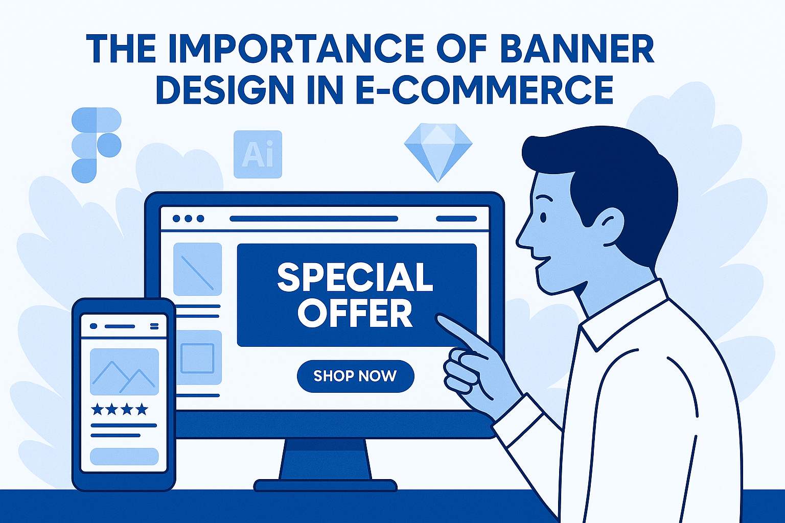
Banner and Ad Design for Your Online Store: Your Guide to Capturing Attention and Increasing Conversions
In the ever-growing world of e-commerce, capturing a visitor's attention has become a real challenge. With thousands of products and endless offers, users scroll quickly and without focus. To stop them in their tracks, the first thing they see needs to be eye-catching, clear, and compelling. That’s where banner design comes in.
A banner isn’t just a pretty image—it’s a powerful marketing tool that quietly influences how visitors behave and whether they convert. When a customer lands on your homepage and sees a professional banner promoting a compelling deal or highlighting a featured product, it can be the deciding moment that pushes them to act.
Whether you're promoting a time-limited sale, launching a new product, or simply trying to keep users engaged, well-designed banners are key to grabbing attention and converting passive visitors into active buyers.
In this article, we’ll cover everything you need to know about designing banners and ads for your e-commerce store—from their importance, types, and key success factors to the common mistakes to avoid.
What Is the Importance of Banner Design in E-Commerce?
Banner design is not just a decorative element on your website—it’s one of the most powerful tools for visual attraction and strategic marketing. A good banner serves a dual purpose: first, it grabs the visitor’s attention amid a crowded interface, and second, it delivers a clear message that encourages immediate action.
In today’s fast-paced online world, visitors spend only a few seconds on a page before deciding whether to stay or leave. Within those seconds, a professional banner can be the trigger that makes them pause, read your message, and start exploring your store. In other words, the banner can be the beginning of a successful conversion journey—or the end of user interest.
Banners also play a crucial role in promoting marketing campaigns, seasonal offers, or specific products quickly and visually. Instead of making the user dig through categories, a good banner directs them straight to what matters.
Beyond that, banners help strengthen your store’s visual identity. When you use consistent colors, clear fonts, and a unified design style, you build a strong and professional image that earns customer trust and improves their perception of your brand.
And most importantly, a well-designed banner directly affects conversion rates. It doesn’t just look good—it drives clicks, actions, and sales. That’s why investing in e-commerce ad design is not just a nice-to-have—it’s a smart move with measurable results.
Types of Banners in E-Commerce
Banners in e-commerce stores aren’t one-size-fits-all. Each type serves a unique purpose and plays a specific role in guiding the customer journey. By understanding and using each banner type strategically, you can create a seamless and visually appealing shopping experience. Here are the main types:
Main Homepage Banner
This is typically the first visual element a visitor sees when landing on your site. It occupies a prominent space on the homepage and is designed to highlight the most important offer or product at that moment.
The main banner must be visually powerful, easy to understand, and instantly attention-grabbing. That means clean design, brand-aligned colors, a short and clear message, and a bold CTA button like “Shop Now” or “See the Offer.”
A strong main banner can significantly boost engagement in the first few seconds of the visit and set the direction for the user's journey through the site.
Internal Page Banners
These banners appear within category pages or specific product sections. Their goal is to highlight sub-offers or featured products that relate to what the visitor is already browsing.
For example, if the visitor is on the “Kitchen Appliances” page, an internal banner might promote “20% off all blenders.” These banners work as subtle guides, enhancing the browsing experience without overwhelming or distracting the user.
Promotional Banners
Promotional banners are used to advertise short-term offers or seasonal campaigns like “Summer Sale” or “Black Friday Deals.” They appear on the homepage or specific landing pages and are designed to create excitement and urgency.
These banners should be energetic and bold: bright colors, large fonts, and messaging that motivates quick action—often supported by countdown timers or urgency phrases like “Limited Time Only.”
Side or Popup Banners
These banners appear on the side of the screen or pop up during navigation. They’re often used for newsletter signups, discount codes, or encouraging users to complete a purchase.
The key to effective side or popup banners is subtlety and timing. They should match the site’s design and appear at smart moments—such as after a few seconds on-site or during exit intent. Overuse or poor timing can annoy visitors, so balance is essential.
Specifications of a Successful Banner
Not every banner is effective. A high-performing banner combines multiple key elements that work together to deliver a clear message, grab attention, and drive action. Here are the most important features of a successful banner you need to focus on:
Clear and Instant Messaging
Visitors don’t have time to read long texts or figure out the point. Your banner should deliver a concise, direct message that’s immediately understandable.
Something like “Up to 50% Off Everything” is far more effective than a vague sentence like “We offer various promotions on selected items.”
Clarity isn’t just in the wording—it’s also in the font size, placement, and contrast.
Strong Call to Action (CTA)
A banner without a clear CTA is a wasted opportunity. Every banner should include a visible, compelling prompt telling the user exactly what to do next.
Examples: “Shop Now,” “Grab the Deal,” “Use the Code.”
Make sure the CTA stands out in a different color and is positioned where the eye naturally goes.
Brand-Aligned Color Scheme
A banner must reflect your store’s visual identity. Use colors that match your brand while ensuring enough contrast to make text and elements readable.
Avoid clashing or overly bright colors. The palette should feel intentional and cohesive with the rest of the store.
High-Quality Images
Whether you’re using product shots or background visuals, your images must be high-resolution and display well across different devices.
Low-quality or pixelated images reduce credibility and make the banner feel unprofessional.
Always choose visuals that are directly relevant. If you’re promoting winter clothing, show actual winter items—not just abstract decorations.
Proper Dimensions for Each Platform
Every platform or screen type has different size requirements for banners. You need to design for multiple formats so your banner looks sharp on desktop, mobile, and even on paid ad placements.
For example, a homepage banner is different in size than a sidebar or popup banner.
Using the right dimensions ensures text and visuals are always clear and prevents formatting issues.
Common Banner Design Mistakes and How to Avoid Them
Just like there are features that make a banner successful, there are also common mistakes in banner design that can ruin its impact and turn visitors away. If you want your store’s ads to perform well, these are the key issues to avoid:
Using Fonts That Are Too Small or Hard to Read
One of the biggest design errors is making text too tiny or choosing overly stylized fonts that are difficult to read. If the visitor can’t quickly scan the message, they’ll ignore it.
Solution: Use large, legible fonts with clear contrast against the background. Test visibility on both desktop and mobile.
Overcrowding the Banner with Text and Images
Too many messages, elements, or images in one banner creates visual noise and confusion. Instead of capturing attention, it overwhelms the viewer.
Solution: Stick to one main message and one strong visual. Use space wisely and avoid clutter.
No Clear Call to Action (CTA)
A banner without a CTA leaves the user unsure of what to do next. It may attract attention, but it fails to convert.
Solution: Always include a direct CTA like “Shop Now,” “Use the Coupon,” or “Start Saving”—and make sure it’s visible and clickable.
Inconsistent or Eye-Straining Colors
Poor color choices—like overly bright, clashing, or low-contrast combinations—can strain the eye and damage the brand image.
Solution: Use a cohesive color palette that reflects your brand identity and enhances readability, not distracts from it.
Irrelevant or Misleading Images
Using images that don’t relate to the offer or product can confuse or disappoint the visitor. It also creates a disconnect between expectation and reality.
Solution: Choose visuals that clearly represent the message. If it’s a banner for sports shoes, show clean, focused images of sports shoes—not random backgrounds.
Each of these mistakes can dramatically reduce the effectiveness of your banner—no matter how great the idea is. And because e-commerce ad design forms a customer’s first impression, it needs to be crafted with care, intention, and user behavior in mind.
In the fast-paced, competitive world of e-commerce, banner design isn’t a minor detail—it’s a strategic tool that directly influences user attention and buying behavior. A well-crafted banner can summarize your message, communicate value, and create a strong first impression in seconds.
Whether you're promoting a flash sale, launching a new product, or highlighting a seasonal offer, your banner is often the first visual interaction a customer has with your brand. For that reason, a great banner needs to combine clarity, visual appeal, relevant imagery, and a compelling call to action (CTA).
At the same time, it’s essential to avoid common mistakes—such as tiny fonts, visual clutter, weak messaging, or unrelated images. The balance between aesthetics and functionality is what makes a professional banner truly effective.
Start today by reviewing your store’s current banners. Do they grab attention? Do they deliver the message? Do they prompt action?
If not, it’s time to redesign—and this guide will help you do it right.